Sunday, August 19, 2012
Best Dock for Windows Vista -- PART 2
After part 1, looking at ObjectDock and RocketDock, we move on to part 2, with CircleDock and XWindows Dock.
CircleDock:
CircleDock took a look at docks, and changed them a bit; took them in a different direction. Circle dock is, in fact, circular. Since there are so many ways it can look, I'll just point you to this Google image search.
CircleDock was created, I imagine, on the idea that a dock should be able to appear at your fingertips, by your cursor. Hence, the circular design. That being said, there is a checkbox one can uncheck to stop it from appearing around your cursor, although I can't imagine anyone wanting to.
You can spin the icons with the scroll wheel, click and drag the Windows button to move it, and click the center button to make it disappear or open the Start Menu (your choice). Icons are, of course, dragged on to the dock, although not as seamlessly as RocketDock or ObjectDock (the icon only appears after you let go). You cannot drag an item off. To remove it, you must right-click it and select "Remove". The "Item Settings" is in the same context menu, and in the settings dialog you change change the icon, the path, the arguments, and the way it starts up (normal, maximized, minimized). CircleDock provides icons for use, some taken from RocketDock (acknowledged in the "About" section of the general settings. The icons are used under a Creative Commons license), others not. CircleDock does let you change the icon of an item directly from the context menu, rather than having you go to the item's settings and then change it. Not only that, but it also features an "Icon Replacement Mode" which allows you to drag an item onto another one, and the icon will be replaced by the one on the item being dragged (in other words, were I to drag iTunes onto Firefox, the Firefox item's icon would be replaced by that of iTunes).
The settings for CircleDock could have a post of their own. I'll go over them section by section, quickly.
--------------------------------
General - enable dock rotation, use same rotation value for all levels, key presses/ mouse wheel scrolls per rotation, set rotation value (radians), enable portability mode, use memory saver, click sensitivity, Z - level
Dock Shape - icons per circle, min. radius, separation between circles, format (constant number of items per circle, maximum number of items per circle)
Background - background image, opacity, size
Centre Button - centre button image, opacity, size, show/don't show start menu when clicked
Dock Items - size, opacity, show Windows file folder menus for right-click menu, hide dock after opening files/folders
Labels - font, style, colour, opacity, shadow, shadow size, shadow darkness, show/don't show labels
Animation - FPS, use poof animation when deleting, rotation animation duration (ms) (say that five times fast!), fade in/out duration (ms)
Location - Centre dock around cursor when shown, lock dock at current position
Toggling -
Toggle Visibility Hotkey : You can select any number of the four checkboxes (Ctrl, Alt, Shift, Win) as well as choose a combo key (pretty much alll keys on the keyboard)
Toggle Visibility Mouse Button : None, MButton, XButton1, XButton2
Show Dock When I move my Mouse to... : Choose any number of the four checkboxes (Screen Left Edge, Screen Right Edge, Screen Top Edge, Screen Bottom Edge), Edge Width/Height, Dwell Time
File -> Dock Icon Associations - Dock Folder -> Icon Association (don't ask me why this is here)
Language - Language file location, + info about chosen file
-------------------------------
Whew. I've never seen so many options. And after that, there's still the About and Help section.
The options do give you a lot of choice, and the circular idea is a good one, but I've gotta say, it's not for me. For one thing, I don't like having to use the keyboard to toggle a dock. But if I choose to have it appear when I move the cursor to the edge of the screen, only half of it appears, because it appears around my cursor! It's a good dock, and I know a lot of people will be happy with it, but I won't be included in that list.
XWindows Dock:
Finally. The last dock. The XWD homepage calls it "Simply the best application launcher ever" and goes on to hype it up as if it were the greatest thing since sliced bread AND chips (salt and vinegar, please). Of course, the download link is broken. I had to do a google search and download it from some other site.
Installation was easy and very fast, but then I ran it. "Access violation at address 004D9B18 in module 'XWindowsDock.exe'. Read of address 00000010." reads the error message. Broken link AND an error message on startup! Good start, guys. However, XWD does open once you click "OK".
At first glance, XWD isn't much compared to some of the others. And honestly, it isn't. The graphics are chintzy, as is the animation, but the biggest con is the options. There are too many options. Just too many. David Pogue has spoken in the past about this. You keep adding things on and on and on, and eventually, it's just either a massive duct-taped together piece of crap, or something with a 60 pound, 1500 page long manual. And I'm sad to say that in my opinion, XWD is the latter.
If you want to take the time to go through every option, and tweak it to your hearts desire, then go ahead. You can do it, and I'm sure you'll be quite happy. The thing is, XWD can only profit from these features if it finds a user whose looking for something specific, like the ability to minimize windows to the dock but exclude certain applications (XWD can do that), edit the sounds for certain actions (XWD can do that), or even have a "Gallery" docklet which can display all the images and videos in a folder of your choice, just by you clicking on it, and let you scroll through them just by moving your mouse to the right or left (XWD can do that, too. It's actually awesome). But the average user isn't going to want these things. XWD is too bloated, and has forgotten what a dock, or launcher, is: a shortcut. And a shortcut should be simple. That's why it's a shortcut. So when you start to fill it up with too many options, it loses its purpose. I will however say that XWD does do the above things very well, and I was impressed.
Well, there you go. My reviews of four docks for Windows. I should mention, in conclusion, that all of these docks worked fine in Windows Vista 64-bit, so if you were concerned about that, don't be (although RocketDock's site says it won't work in x64, they were LYING... or something). And after this two-day experiment, I'm proud to announce that I'll be using RocketDock for the foreseeable future, until the point when a new dock will come along, and I'll have to try it out. And when I do, maybe I'll review it for you. Until that day, I'll continue with regularities. My friends, I'll see you Tuesday.
Saturday, August 18, 2012
Environmental Design: The Greenbox
 The Greenbox (click for an explanatory video) is, like all things I love, a well-needed redesign. It's environmentally friendly and makes great use of the features of the ordinary pizza box. I think "crotchfire", one of the commenters on YouTube, put it best:
You don't have to use paper plates, or waste water washing dishes. You also don't have to use an extra box to store the pizza. Cardboard that is soiled by food can't be recycled, thus they are making use of something you are going to have to throw away anyways. It is also made of 100% recycled material, so no trees are being chopped down to produce the box.If you want more information you can check out their website, greenboxny.com. The Greenbox is what this blog is all about: intelligent design. So spread the word!
Friday, August 17, 2012
Desktop: Summer Beach
A recent wallpaper-downloading binge has turned me into a desktop addict. Or maybe a DADD victim (Desktop Attention Deficit Disorder). Either way, I had to try my hand at another setup with this wallpaper, to get me into the right mood for summer.

(click for larger version)'
(download the wallpaper here)
As you can see, I opted for a refreshing change in configs, mostly because I wanted them to fit in with the wallpaper. I am, as usual, running Rainmeter v1.1.
In the top left-hand corner, I’ve got iTunes White, by r3ginald. While it leaves a little to be desired, it’s handy skin and looks great. For more of my thoughts on it, check out last week’s post. In addition to iTunes White, I’ve got the iTunes toolbar in my taskbar. Just right click the taskbar and navigate over to Toolbars and check “iTunes”, and then whenever you minimize iTunes it’ll show up in your taskbar.
In the middle, I’ve got the HUD.Vision White Clock.Vision skin. It provides a nice compromise between simplicity and futurism, and it fits well into the landscape.
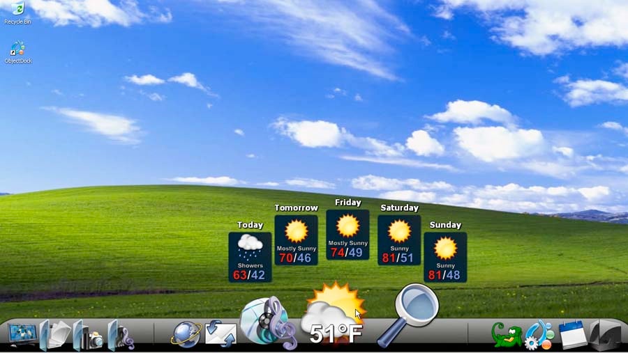
Sandwiching it, I’ve got the Simple Sentence Sun and Weather skins, the latter being modified slightly to fit in between the clouds and the sun. They’ve got a nice, calming quality to them, mostly due to the simple prose and font, and they fit in well with the sunset and beach.
Underneath them, I’ve got the Simple Sentence Date config which seemed the perfect missing piece for the setup.
In the end, I’m quite happy with this setup. It’s nice and calming, and the choice of skins sets new priorities for the summer; less about the tech info, more about the casual stuff. I also like the organization; the time and date are together, the sun rise/set information is near the sun, and the weather skin is near the clouds and sky. It’s subtle, but nice.
Thursday, August 16, 2012
Desktop: Cityscape
Once I found this wallpaper I knew I had to make a desktop setup around it; I just love cityscapes, and this is one of the best I’ve seen.

(click for larger version)
(download the wallpaper here)
Before I start, for those of you unfamiliar with the drill, I’m running Rainmeter v1.1.
You’ll notice many of the same elements as last time. In the top left corner, you’ll see my tweaked version of Enigma’s Sidebar Systems skin. All the essential information in one box. Handy.
Below it is Enigma’s Arcs beautifully futuristic yet informative clock, and to the right, I’ve got Cal-Week and Clock. Small but visible, they’re the perfect compliment to Arcs.
To the right of them, I’ve got HUD.Vision’s White Network.upload and Network.download skins, for a quick check up on my connection.
In the top right corner, I’ve got HUD.Vision’s White CPU skin which gives me a quick look at the system information and usage as well as the most-demanding process, so I don’t need to open up Task Manager.
And in the bottom left corner, the iTunes White skin by R3ginald. While it’s style may not be of the highest calibre (there is both a pause and play button; the volume is not controlled by dragging but rather by repeatedly clicking the two speaker icons), it’s extremely handy and fits in well with the background and other skins. It should be noted I tried to install Multi-Plugin v2.1 for iTunes so that I could install a black skin and use the mini player, but my efforts resulted in my having to reinstall iTunes (due to compatibility issues) and both help and updated versions are difficult to find online. I will persist, though.
I also changed the window colour to “Graphite” for a slightly darker look, and changed my Firefox persona to “Dark Cityscape”. That’s all up to you, but I find it’s a nice addition.
Thanks for reading! If you’ve got any questions, please leave a comment. See you next time.
Sunday, August 12, 2012
Best Dock in Windows Vista -- Part 1
For a while now, Macs have had a dock.
 Microsoft still hasn't implemented such a feature for Windows, although they might in the future.
For some, a Dock might be an inconvenience, or a boon. I believe that it depends on how you use it. Still there are some who don't want one, and that's fine. They may stop reading. But for those of you interested in acquiring one for your Windows machine, read on.
There are two big names in the Windows dock business: ObjectDock and RocketDock. In this two day special, I'll talk about them, as well as two others: Circle Dock, and XWindows Dock.
ObjectDock:
At startup, after a very quick installation, ObjectDock looks like this:
Microsoft still hasn't implemented such a feature for Windows, although they might in the future.
For some, a Dock might be an inconvenience, or a boon. I believe that it depends on how you use it. Still there are some who don't want one, and that's fine. They may stop reading. But for those of you interested in acquiring one for your Windows machine, read on.
There are two big names in the Windows dock business: ObjectDock and RocketDock. In this two day special, I'll talk about them, as well as two others: Circle Dock, and XWindows Dock.
ObjectDock:
At startup, after a very quick installation, ObjectDock looks like this:
 The dock itself isn't very attractive, the icons pop up enormously, and the icons look like they're from the nineties. You can change the zoom amount, but to change the icons and themes, you must download or make a package. The instructions aren't too clear, and it seems like a hell of a lot of work.
Apart from that, however, the rest looks good. You can choose between no zoom, zoom, or swing effects, add separators or "Docklets", such as weather. You can edit the positioning of the dock (top, bottom, left, right) and its offset from the edge, as well as it's "interaction" (keep on top, hide in background when not in use, hide off-screen when not in use, and keep on bottom). You can change the delay time, but only between "short" and "long". There are white arrows for running programs if you so desire, and you can have windows minimize to the dock.
One feature I was impressed with was the "Search Google Now" docklet. You click, a little textbox comes up right there, you type and hit enter, and it opens up your browser and takes you directly to a google search for what you wrote. Finally a good instant-search method.
Unfortunately, it's not enough to make up for the rest of its problems. It's an alright dock, and it does its job, but it's not for me.
RocketDock:
This is what RocketDock looks like:
The dock itself isn't very attractive, the icons pop up enormously, and the icons look like they're from the nineties. You can change the zoom amount, but to change the icons and themes, you must download or make a package. The instructions aren't too clear, and it seems like a hell of a lot of work.
Apart from that, however, the rest looks good. You can choose between no zoom, zoom, or swing effects, add separators or "Docklets", such as weather. You can edit the positioning of the dock (top, bottom, left, right) and its offset from the edge, as well as it's "interaction" (keep on top, hide in background when not in use, hide off-screen when not in use, and keep on bottom). You can change the delay time, but only between "short" and "long". There are white arrows for running programs if you so desire, and you can have windows minimize to the dock.
One feature I was impressed with was the "Search Google Now" docklet. You click, a little textbox comes up right there, you type and hit enter, and it opens up your browser and takes you directly to a google search for what you wrote. Finally a good instant-search method.
Unfortunately, it's not enough to make up for the rest of its problems. It's an alright dock, and it does its job, but it's not for me.
RocketDock:
This is what RocketDock looks like:
 RocketDock has many of the same features of ObjectDock, but in my opinion, is better. There are about 20 different themes, and you can download more. You can control the opacity, the font, font colour and outline and its opacity. You can change the quality, opacity, zoom size, hover effect (bubble, plateau, flat, and nothing) of the icons. The positioning options are the same, except you can change the centering, and which monitor to display the dock on (if you have multiple monitors).
The behaviour options are very similar. You can change all the settings for AutoHide, up to the millisecond.
You can also allow windows to minimize to the dock, as well as show running application indicators and open running application instances (if an application is already running, open it's instance). You can also lock items on the dock, and change the language.
Now to change the theme, you go into RocketDock settings, but to change an icon, you right click the item and click on "Icon Settings". You can choose from certain .png icons, as well as download more online (easily, I might add). You can also choose the arguments for the item, as well as whether it should run normal, maximized, or minimized.
You can also add (from the right-click context menu) a file, a path, a blank icon, or a separator, as well as a clock docklet, or, if you install it, a Stacks docklet. This is an add-on which can be easily downloaded and installed, and it acts like the stacks for folders on the Mac. It's very customizable. More info here. It's the only add-on that I have installed, but there are tons more, with a very dedicated community supporting them.
Overall, RocketDock really is a step up from ObjectDock. It's cleaner, prettier, and better. It can really make interactions seamless, and the themes really help it blend in.
To find out my opinions on CircleDock and XWindows Dock, tune in next week to read PART 2 of Boating in Windows Vista -- Where to get the best dock. See you then.
RocketDock has many of the same features of ObjectDock, but in my opinion, is better. There are about 20 different themes, and you can download more. You can control the opacity, the font, font colour and outline and its opacity. You can change the quality, opacity, zoom size, hover effect (bubble, plateau, flat, and nothing) of the icons. The positioning options are the same, except you can change the centering, and which monitor to display the dock on (if you have multiple monitors).
The behaviour options are very similar. You can change all the settings for AutoHide, up to the millisecond.
You can also allow windows to minimize to the dock, as well as show running application indicators and open running application instances (if an application is already running, open it's instance). You can also lock items on the dock, and change the language.
Now to change the theme, you go into RocketDock settings, but to change an icon, you right click the item and click on "Icon Settings". You can choose from certain .png icons, as well as download more online (easily, I might add). You can also choose the arguments for the item, as well as whether it should run normal, maximized, or minimized.
You can also add (from the right-click context menu) a file, a path, a blank icon, or a separator, as well as a clock docklet, or, if you install it, a Stacks docklet. This is an add-on which can be easily downloaded and installed, and it acts like the stacks for folders on the Mac. It's very customizable. More info here. It's the only add-on that I have installed, but there are tons more, with a very dedicated community supporting them.
Overall, RocketDock really is a step up from ObjectDock. It's cleaner, prettier, and better. It can really make interactions seamless, and the themes really help it blend in.
To find out my opinions on CircleDock and XWindows Dock, tune in next week to read PART 2 of Boating in Windows Vista -- Where to get the best dock. See you then.
Microsoft still hasn't implemented such a feature for Windows, although they might in the future.
For some, a Dock might be an inconvenience, or a boon. I believe that it depends on how you use it. Still there are some who don't want one, and that's fine. They may stop reading. But for those of you interested in acquiring one for your Windows machine, read on.
There are two big names in the Windows dock business: ObjectDock and RocketDock. In this two day special, I'll talk about them, as well as two others: Circle Dock, and XWindows Dock.
ObjectDock:
At startup, after a very quick installation, ObjectDock looks like this:
The dock itself isn't very attractive, the icons pop up enormously, and the icons look like they're from the nineties. You can change the zoom amount, but to change the icons and themes, you must download or make a package. The instructions aren't too clear, and it seems like a hell of a lot of work.
Apart from that, however, the rest looks good. You can choose between no zoom, zoom, or swing effects, add separators or "Docklets", such as weather. You can edit the positioning of the dock (top, bottom, left, right) and its offset from the edge, as well as it's "interaction" (keep on top, hide in background when not in use, hide off-screen when not in use, and keep on bottom). You can change the delay time, but only between "short" and "long". There are white arrows for running programs if you so desire, and you can have windows minimize to the dock.
One feature I was impressed with was the "Search Google Now" docklet. You click, a little textbox comes up right there, you type and hit enter, and it opens up your browser and takes you directly to a google search for what you wrote. Finally a good instant-search method.
Unfortunately, it's not enough to make up for the rest of its problems. It's an alright dock, and it does its job, but it's not for me.
RocketDock:
This is what RocketDock looks like:
RocketDock has many of the same features of ObjectDock, but in my opinion, is better. There are about 20 different themes, and you can download more. You can control the opacity, the font, font colour and outline and its opacity. You can change the quality, opacity, zoom size, hover effect (bubble, plateau, flat, and nothing) of the icons. The positioning options are the same, except you can change the centering, and which monitor to display the dock on (if you have multiple monitors).
The behaviour options are very similar. You can change all the settings for AutoHide, up to the millisecond.
You can also allow windows to minimize to the dock, as well as show running application indicators and open running application instances (if an application is already running, open it's instance). You can also lock items on the dock, and change the language.
Now to change the theme, you go into RocketDock settings, but to change an icon, you right click the item and click on "Icon Settings". You can choose from certain .png icons, as well as download more online (easily, I might add). You can also choose the arguments for the item, as well as whether it should run normal, maximized, or minimized.
You can also add (from the right-click context menu) a file, a path, a blank icon, or a separator, as well as a clock docklet, or, if you install it, a Stacks docklet. This is an add-on which can be easily downloaded and installed, and it acts like the stacks for folders on the Mac. It's very customizable. More info here. It's the only add-on that I have installed, but there are tons more, with a very dedicated community supporting them.
Overall, RocketDock really is a step up from ObjectDock. It's cleaner, prettier, and better. It can really make interactions seamless, and the themes really help it blend in.
To find out my opinions on CircleDock and XWindows Dock, tune in next week to read PART 2 of Boating in Windows Vista -- Where to get the best dock. See you then.
3 Lesser Known Features of Windows Vista
To be clear, these are features present in Vista, but not necessarily new.
1. Folder Toolbars (new)
By dragging a folder to the top of your desktop screen, you an create a new toolbar for that folder, which shows some of the files within. It can be made bigger or smaller (to show more or less files) as well as choose between large icons and small icons, showing text or not, showing folder name or not, staying on top, or auto-hide.
The toolbar isn't beautiful, but it's passable. It apparently cannot be moved to other sides of the screen, although you can get a four-arrow cursor by dragging on the folder name. Also, the selection is one-click, even though the graphics are the same as in a folder, which is a bit confusing.
2. The Run dialog and it's direct approach in Windows Vista (new and not new)
The run dialog has always been one of my favourite features of windows, being a techy guy who likes shortcuts. It allows you to quickly run a program or open a folder (see next item). What I use it most for is the programs that aren't always easy to access, like Paint, Notepad, and Calculator. Instead of going into the start menu and looking for them, I can run them quickly with the Run dialog. Since the default path is C:\WINDOWS\system32\ , you don't even need a path. All I type is "mspaint", "notepad", or "calc" (their respective file names, without the extension). In Vista, you don't even need to click the "Run" button in the start menu. You can just enter everything in the search bar! Make sure it doesn't conflict with search entries, though.
3. System and User Variables (not new)
I love this feature. By going into the Control Panel, System and Maintenance, System, Advanced System Settings (on the left) and clicking on "Environment Variables", you can edit the User and System Variables. These are essentially shortcuts to be used in the Run dialog and other rare circumstances. All you have to do is set up the variable (such as "pf") and the Value (such as "C:\Program Files"). If there ever a program or folder you are always running/accessing via the Run dialog, this is perfect for you. I always use it for program files. It makes things very easy.
Review: Dell Studio 15
Searching for a perfect laptop is really hard! I never realized!
After 6 years with my old dell, I decided it was time for a new computer. I had a few criteria: design, screen size, webcam and specs.
I want a laptop that looked cool, with a lid that snapped shut and could be opened with one hand (both manipulating the switch thing and the bottom being heavy enough to not have to hold it down). Of course, the Dell does neither of the last two, but life's taught me that you can get used to anything.
I also wanted a 15 inch screen, a webcam, and good specs (Windows Vista, cause it actually doesn't suck, good RAM, 320 GB hard drive, and reasonable stats for the rest).
After a few months, I think that the Dell Studio 1555 is really the laptop for me.
 Specs:
Processor: Intel® Core™ 2 Duo T9550 (2.66GHz/1066Mhz FSB/6MB cache)
Memory: 4GB Shared Dual Channel DDR2 at 800MHz
Keyboard: Back-lit Keyboard
LCD Panel: 15.6” Full High Definition (1080p) High Brightness LED Display with TrueLife™ and Camera
Video Card: 512MB ATI Mobility Radeon HD 4570
Hard Drive: Size: 320GB SATA Hard Drive (5400RPM)
System Color: Black Chainlink
Operating System: Genuine Windows Vista® Home Premium Edition, 64-bit SP1
Combo or DVD+RW Drive: 8X Slot Load Super Multi (DL DVD+/-R Drive + RAM support)
Sound: Creative Sound Blaster X-Fi MB
Wireless: Intel® WiFi Link 5100 802.11agn Half Mini-Card
Battery: 56 Whr Lithium Ion Battery (6 cell)
Processor Labels: Intel® Core™ 2 Duo Processor
Bluetooth: Dell Wireless 370 Bluetooth Internal (2.1)
Ports:
2 USB, 1 eSATA, 1 HDMI, 1 1394, 1 mic, 2 audio out, 1 LAN thing, and 1 video out (I think). Also has SD card slot.
It's got a glossy lid (which normally I hate) but has a textured background underneath it which makes it look much more awesome. The design continues on the inside.
The touch-sensitive media control areas above the keyboard have been replaced by buttons on the F keys. If you order a backlit keyboard, there are three levels of lighting: none, total, and partial.
For some reason, Apple is the only company that makes good trackpads. The Dell one isn't great (hurts your finger if you slide to fast), but after a little use, one can get used to it. There are motions for zooming, as well as vertical and horizontal scrolling.
The speakers are located above the keyboard, near the screen, and in my experience, aren't bad.
Overall, it's really a great laptop.
Specs:
Processor: Intel® Core™ 2 Duo T9550 (2.66GHz/1066Mhz FSB/6MB cache)
Memory: 4GB Shared Dual Channel DDR2 at 800MHz
Keyboard: Back-lit Keyboard
LCD Panel: 15.6” Full High Definition (1080p) High Brightness LED Display with TrueLife™ and Camera
Video Card: 512MB ATI Mobility Radeon HD 4570
Hard Drive: Size: 320GB SATA Hard Drive (5400RPM)
System Color: Black Chainlink
Operating System: Genuine Windows Vista® Home Premium Edition, 64-bit SP1
Combo or DVD+RW Drive: 8X Slot Load Super Multi (DL DVD+/-R Drive + RAM support)
Sound: Creative Sound Blaster X-Fi MB
Wireless: Intel® WiFi Link 5100 802.11agn Half Mini-Card
Battery: 56 Whr Lithium Ion Battery (6 cell)
Processor Labels: Intel® Core™ 2 Duo Processor
Bluetooth: Dell Wireless 370 Bluetooth Internal (2.1)
Ports:
2 USB, 1 eSATA, 1 HDMI, 1 1394, 1 mic, 2 audio out, 1 LAN thing, and 1 video out (I think). Also has SD card slot.
It's got a glossy lid (which normally I hate) but has a textured background underneath it which makes it look much more awesome. The design continues on the inside.
The touch-sensitive media control areas above the keyboard have been replaced by buttons on the F keys. If you order a backlit keyboard, there are three levels of lighting: none, total, and partial.
For some reason, Apple is the only company that makes good trackpads. The Dell one isn't great (hurts your finger if you slide to fast), but after a little use, one can get used to it. There are motions for zooming, as well as vertical and horizontal scrolling.
The speakers are located above the keyboard, near the screen, and in my experience, aren't bad.
Overall, it's really a great laptop.
Subscribe to:
Posts (Atom)